Greenbay brand assets
Logos, colours, and guidelines for press, partners, and integrations. If you cover us in the press or display our logo in your product, please follow the rules below.
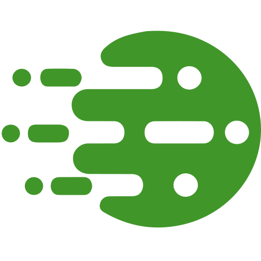
How the mark is built
The mark is a green disc with horizontal motion-trail elements, evoking a vehicle in motion against a depot. It uses four named parts:
Bay
The green disc body. The company's namesake form.
Channel
The central horizontal slot through the Bay.
Ports
The two circular cutouts on the Bay.
Trail
Six elements left of the Bay, on three lanes. Each lane has one block and one marker.
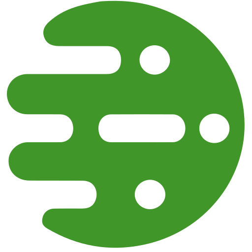
Logo and variants
Use the primary mark by default. Use mono variants when colour is unavailable. Use the lockups when the company name needs to appear alongside the mark.
Horizontal lockup
Mark and wordmark side by side. Use in headers and signatures.
Stacked lockup
Mark above the wordmark. Use for square avatars, app stores, and social profiles.
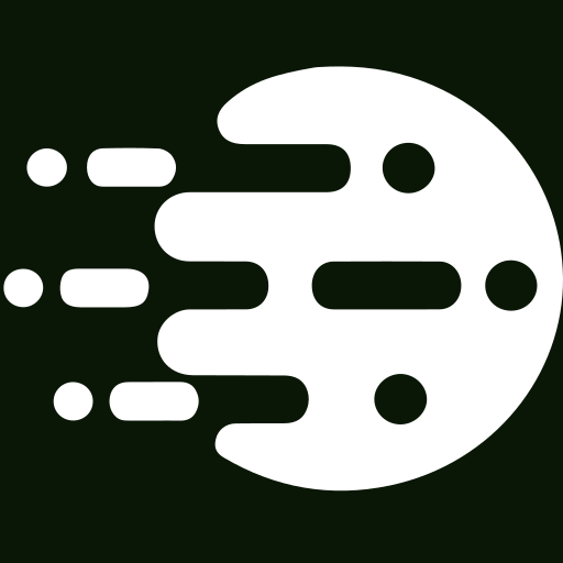
Mono white
White variant for dark backgrounds, photos, and brand-colour fills.
Favicon
The disc-only mark also serves as the browser favicon. The internal cutouts hold up to about 32px; below that they start to muddy.
Colour palette
Greenbay green is the primary brand colour. Black and white are used for mono variants and contrast pairings.
Greenbay green
Primary brand colour and default fill
RGB 65, 150, 42
Text ink
Body text, used over light backgrounds
RGB 10, 23, 6
Black
Mono variant for print and low-colour UIs
RGB 0, 0, 0
White
Knockout on dark or brand-colour fills
RGB 255, 255, 255
Typography
The wordmark uses Montserrat Semibold (600), the same family used across the product. JetBrains Mono is used for data values and code.
Montserrat Semibold
Wordmark, headings, UI labels
JetBrains Mono
Data values, timestamps, codes
Press and partner enquiries
For interviews, partnership questions, or anything not covered here, write to us.
info@greenbay.solutions